
Stop comparing AI tools by feature lists—do this instead
You’ve done it too: opened two browser tabs, lined up feature columns, and started checking boxes. 4K output? Check. Multiple models? Check. API access? Check. The spreadsheet looks balanced. Then you run your first real prompt, and one tool delivers a coherent hand with five fingers while the other gives you something that looks like a melted glove. The feature list told you nothing useful.
This is the feature-list trap. It rewards breadth over depth and steers buyers toward tools that check every box but underperform on the single dimension that actually matters: whether the output works for your use case. Two platforms with identical model names can produce wildly different results from the same prompt. Resolution specs are worthless if generation takes ninety seconds per image. And integration friction—the silent dealbreaker—never appears on a comparison grid.
The real differentiators in generative media tools live where spreadsheets can’t see them: output realism, iteration speed, and workflow fit. Here’s how to evaluate them properly.
Output realism as a true differentiator
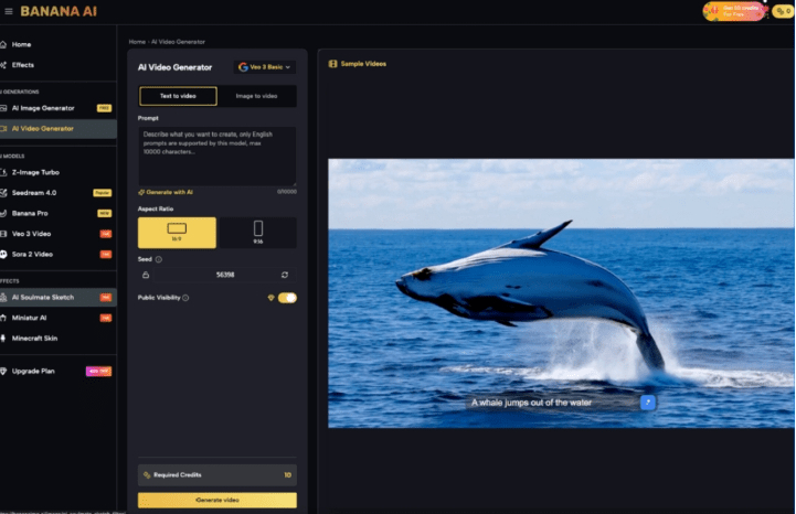
Model names sound impressive on a feature list. Z-Image Turbo, Seedream 4.0, Banana Pro—labels imply capability, but they don’t guarantee quality. What matters is how the model handles edge cases: hands, lighting consistency, anatomical proportion, and text rendering.
This is where Banana AI Image stands out among free-tier tools. Run the same prompt—“a barista pouring latte art into a ceramic cup, morning light from the left”—across three platforms, and the differences appear at pixel level. One botches the hand holding the cup. Another gives the cup an impossible shadow. Banana AI Image holds consistency across both standard and stylized prompts in a way that most free tools don’t.
I ran this test with five prompting scenarios, and the delta wasn’t subtle. The platform that ranked highest on model variety produced the worst anatomical results. Vice versa, the one with fewer listed models delivered usable output every time. Feature grids told me nothing. The images told me everything.
The lesson: ignore model names during initial evaluation. Design a stress test of five prompts that specifically challenge the tool’s weak points—hands, text, multiple subjects, unusual lighting, complex backgrounds. Score the outputs blind. That’s your real comparison.
Speed and iteration cadence matter more than resolution
Resolution is a vanity metric in a vacuum. 4K output sounds great until you realize you’re waiting 90 seconds per image. For a marketing team iterating ad creatives at scale, that pace is a workflow killer. Sub-10-second generation with acceptable quality beats high-quality 60-second generation almost every time, because speed enables volume testing, which surfaces what actually performs.
Banana AI Image’s turnaround on the free tier makes it viable for exactly this kind of volume exploration. You can generate, assess, discard, and regenerate in the time it takes another tool to render a single frame. That iteration loop is where the real value lives, not in the final resolution number.
What can’t be concluded safely: that faster generation always wins for every use case. If you’re producing a hero image for a billboard or a frame that needs to survive 4K projection, generation speed may be secondary to absolute quality. But for the majority of digital content—social assets, ad variations, product mockups, concept boards—iteration pace determines whether you can actually find the best image or just settle for the first one that looks okay.

Workflow integration: the silent dealbreaker
A standalone generator with excellent output still fails if it can’t slide into how you actually work. No API? No batch mode? Export locked to a single format? These integration points never appear on feature grids because they’re invisible until you try to ship assets.
Most comparison articles ignore integration friction because it’s invisible in screenshots. But the difference between a tool you use daily and a tool you abandon after three tries often comes down to something simple: Can I batch-generate twenty variations without clicking through menus? Can I export at my target size without a post-processing step? Does the tool work within my editing or scripting pipeline?
Here’s where honesty matters: no single tool handles every workflow equally well. A strong image generator may still be wrong for a video-first pipeline. A tool with excellent API documentation might lack the prompt-tuning controls your team needs. The best evaluation method is to define your actual delivery chain—prompt → generate → export → edit → publish—and measure where each tool adds friction, not just where it adds features.
Building your own comparison framework in 3 steps
You don’t need another feature list. You need a test that reflects real work. Here’s a three-step framework that takes about an hour and reveals more than any comparison table:
Step 1: Define your critical output dimension. Is it photorealism? Style consistency? Subject accuracy? Prompt adherence? Pick one dimension that matters most for your primary use case. Everything else is secondary.
Step 2: Run five worst-case prompts through each tool. Write prompts that deliberately stress your chosen dimension. If photorealism matters, test hands, water, and human faces. If style consistency matters, test the same subject across different scenes. Score the outputs blind—remove watermarks or file names so you don’t know which tool produced which image.
Step 3: Measure end-to-end time from prompt to usable asset. Start a stopwatch when you open the tool. Stop it when you have a file ready for production—not just rendered, but exported at the right size and format, with any necessary manual fixes applied. This number accounts for generation speed, export friction, and quality degradation that requires post-processing.
Tools like Banana AI earn their evaluation on these dimensions, not on how many models they list. The actual test is whether they deliver usable output fast enough to support real iteration.
When checking the box costs more than the tool
Feature-list comparisons are comfortable. They give you certainty on paper. But that certainty is expensive: it leads to switching costs when the tool underdelivers, missed quality targets when you discover the fourth model in the list is the only one that works, and wasted time when integration friction kills adoption across your team.
Honest take: we still don’t know how these tools will hold up under next year’s model updates. The landscape shifts every quarter. Choosing today should prioritize flexibility and fast iteration over rigid specs. A tool that lets you test, discard, and retest in minutes is worth more than one that checks every box on a static spreadsheet.
The next time you evaluate generative media tools, close the feature tabs. Open the tool itself. Run your worst-case prompt. Watch how fast the output appears. See if you can export without fiddling. That five-minute test will tell you more than any comparison article ever could.